
InterSEA
About the project
Intersea is an app that helps people with hearing loss find interpreters.
As well as allowing the interpreters to create a profile and be found by people that require their assistance.
During my volunteer experience in the SEA NGO, I did an analysis and a redesigning proposal of the app interfaces

Redesign process and results
I noticed that the app design was using 2 colors. Orange for the NGO, and purple specifically for the app. However, their usage was not following any criteria.
To guarantee a good usability and accessibility for all users, I modified the colors and their combinations across different components. The chromatic palette I suggested ensures a good contrast between background and forward screens.
I also adapted the button sizes. Meaning that clickable areas should respect WCAG recommended measures.
These standards were also applied to icons, harmonizing colors and measures


The app had 2 logos: NGO and app. Both were present in all sections.
To avoid visually overloading the interfaces, I proposed then using only the app logo and placing it unically in the screens where it should be placed.
The app redesign was based on a minimalist approach by showing in every screen only the needed information.

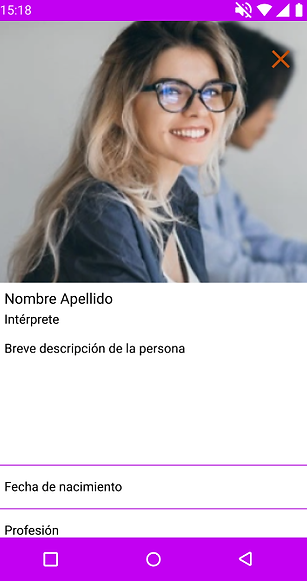
It was important to the NGO that the app has some information about their daily work.
I relocated that information inside a specific section of the app, to allow the users to learn more about the NGO, if they want to do so.
In the original version, the section “Latest News” appeared as a popup, annoying the experience. To solve that, I reacomodated this information in a place where the user can decide how and when to reach it.


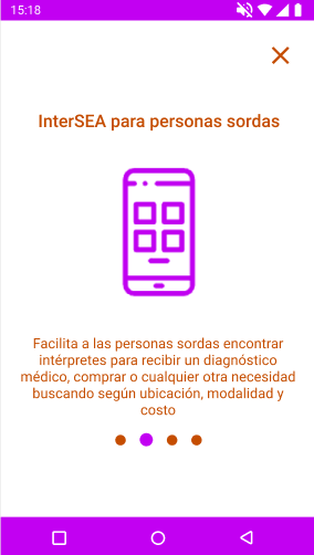
I highlighted the importance of an onboarding process, so I designed one for the user with simple and summarized steps that presented the app’s main features and benefits.

Describe your image
Describe your image

Describe your image
Describe your image
The homepage was redesigned around the main feature of the app: finding an interpreter.
Adding a search box with two main parameters, thus offering an easy way for the user to reach their goal.


The interpreter request process had many steps across multiple screens.
To simplify it, I unified all the steps on a single card, through which the users can state their demands, requirements and availability. All in one step.
What is more, to prevent mistakes, when the request is sent, there is a notification message to explain next steps.

